
Should Tailwind Be Your First Choice CSS?
When I first examined Tailwind CSS I was rather grossed out by the number of classes that were being written….
<button class="rounded-lg px-4 md:px-5 xl:px-4 py-3 md:py-4 xl:py-3 bg-teal-500 hover:bg-teal-600 md:text-lg xl:text-base text-white font-semibold leading-tight shadow-md">Click Here</button>But after one of our developers spun up a single page application using the framework during our Friday “code and learn afternoons” there was no turning back!
So what is Tailwind CSS?
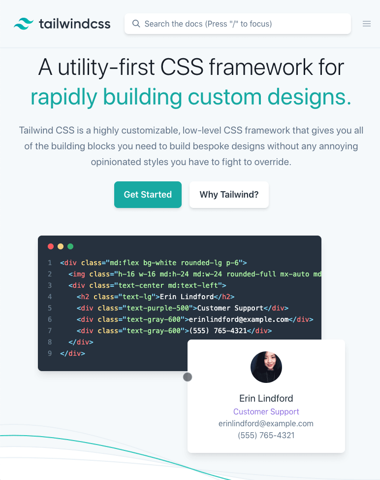
The official documentation describes the framework as “a highly customizable, low-level CSS framework that gives you all of the building blocks you need to build bespoke designs without any annoying opinionated styles you have to fight to override.“
Back in early October 2017 Adam Wathan, a full-stack web developer in the U.S.A with the support of Jonathan Reinink, David Hemphill and Steve Schoger started to explore the current problems they were facing with CSS. Adam outlined his early concerns in a blog article CSS Utility Classes and Separations of Concerns. It paints a clear picture on why a solution such as the Tailwind CSS framework became a necessity (a must read If you are a web developer).
When Style Matters.
From our own personal experience, web developers tend to run into a lot of problems with either naming things or breaking things because of overlapping complex CSS styles. As developers we tend to overcomplicate things by creating extensive naming conventions to the point where it becomes far too difficult to track the impact that styling may have on a website/application.

The Tailwind CSS framework addresses these problems by creating small, composable utilities with a fixed set of options that allow developers to apply existing classes directly into the HTML Markup.
Not Just Another CSS Framework…
Sure, there are UI Kits such as Bootstrap, Foundation and Material UI that can give developers a baseline to work with but these kits influence design by pre-determining the structure and design of a component or utility. When you are trying to create a beautifully designed website, there are sections within the website that libraries cannot accommodate for and you inevitably need to write a vast amount of custom CSS.
There are methodologies such as BEM that help to define how developers should organise custom CSS. But, we are still subject to the “opinon” of the original developer and their preferred language/style to some degree. The codebase; folders, file names and naming conventions, inevitably differ from project to project no matter how much you we try.
Is It Really Utility First?
Yes – the goal is to leverage as much of the framework as possible and they do provide the flexibility to extend your CSS very easily. In support of this too they have documentation to leverage Preprocessors alongside PostCSS to reduce your page weight:
- https://tailwindcss.com/docs/using-with-preprocessors
- https://tailwindcss.com/docs/adding-new-utilities
- https://tailwindcss.com/docs/controlling-file-size/#removing-unused-css
@tailwind base;
@tailwind components;
@tailwind utilities;

//Add your Custom CSS here
WordPress + Tailwind CSS + Timber
Most of the websites we build are developed in WordPress for our clients. With a 34% market share (and growing year on year) it provides both clients and developers familiarity, maintainability, can be heavily customised as well as having an extensive amount of resources/plugins at its disposal.
To utilise Tailwind CSS in WordPress we needed a solution to reduce the amount of redundant code that we typically see when developing WordPress PHP templates. WordPress template files, and .php files as a whole, are not the greatest when it comes to structuring your code into repeatable components and passing variables around. Yet, by using a WordPress framework like Timber we can clean up our templates and quite easily incorporate Tailwind CSS. Timber uses Twig templates, a templating system that sits on top of PHP. Essentially, it cleans up the PHP templates drastically, allowing us to create structured, clean and maintainable code.
You could also overcome this problem by using a Javascript framework such as VueJS, ReactJS or a more modern solution such as static site builders; GatsbyJS or NuxtJS.
Simple WordPress Components
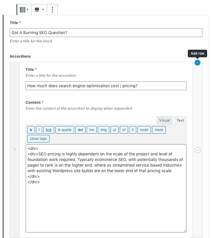
A great example to check out on our website that uses both Twig templates and Tailwind CSS are our accordions. They consist of a parent component called accordions.twig that loops through the partial accordion.twig. The only additional class that we needed to apply was .accordion to perform the necessary JS targeting for opening and closing each accordion.
<h2 class="text-center text-white mb-8">{{ fields.title }}</h2>
{% for accordion in fields.accordions %}
    {% include 'partial/accordion.twig' %}
{% endfor %}
Parent template accordions.twig
<div animate-down class="accordion flex justify-center {{ class ? class : '' }}">
    <div class="w-full max-w-3xl mb-8 flex flex-col p-8 rounded shadow bg-gradient-to-top-medium-blue-to-dusk-blue {{ loop ? 'sm:mx-8' : '' }}">
        <div class="group flex justify-between accordion-title cursor-pointer items-center relative">
            <h3 class="transition group-hover:text-squash text-white font-semibold mb-0 pr-8 text-base">
                {{ accordion.title }}
            </h3>
            <i class="absolute right-0 icon-add group-hover:text-squash transition"></i>
            <i class="absolute right-0 icon-minus group-hover:text-squash transition"></i>
        </div>
        <div class="accordion-content text-powder-blue">
            {{ accordion.content }}
        </div>
    </div>
</div>
Child template accordion.twig
Creating Gutenberg Blocks
On top of that – by leveraging Advanced Custom Fields to build out our Gutenberg blocks our developers can now spin up blocks for our clients to use that are extremely accessible in no time.
Efficient Web Development
To ask any one of our web developers to jump in and change the CSS; to change the font sizing, padding, margins, icons, transitions or anything else, we are 100% confident that it’s not going to break anything else making it a quick task. Even though Tailwind CSS is super flexible, and still allows developers to inject custom CSS, it has eliminated the need for custom classes to be created in 97% of the codebase. For us this is really important, it heavily reduces any of these risks and headaches for any developer fresh on the project.
As an agency – it’s a huge benefit, as we are seeing a massive improvement in the time it takes for our developers to produce work. It’s surprising how much thinking of names can break the momentum and flow of a web developer. In some projects our developers don’t have to write a single line of CSS.
Tailwind CSS and its Growing Popularity
It’s easy to jump on the band wagon, especially when it comes to the latest tools within the web development world, but with the backing of the massive Laravel community and with it starting to be used by some larger organisations, it’s definitely worth paying attention to. Here are a handful of websites that are using Tailwind CSS:
- https://lottiefiles.com/ – Airbnb
- https://diablo.blizzard.com/en-gb/ – Blizzard
- https://send.firefox.com/ – Mozilla
- https://laracasts.com/ – Laravel Community
- https://builtwithtailwind.com/ – and many more…
Continued Support
Adam Wathan and Steve Schoger (the duo that famously received more than 238k* claps on medium are giving it a good crack. They are making it their full-time job to continue developing Tailwind CSS. Also, they are soon to be releasing pre-made components and templates that will be ready to go for developers to get their projects kick started – if that’s your thing.
We have been using Tailwind when building out WordPress websites for our clients over the last 6 months now, this website included, and there has been no looking back.
As a digital agency we’re constantly thinking about ways of bringing consistency into our projects to deliver an efficient and maintainable process that inevitably saves our client’s both time and money.
For more information and to get started visit Tailwind or reach out to the Bud team to start a project in Tailwind.
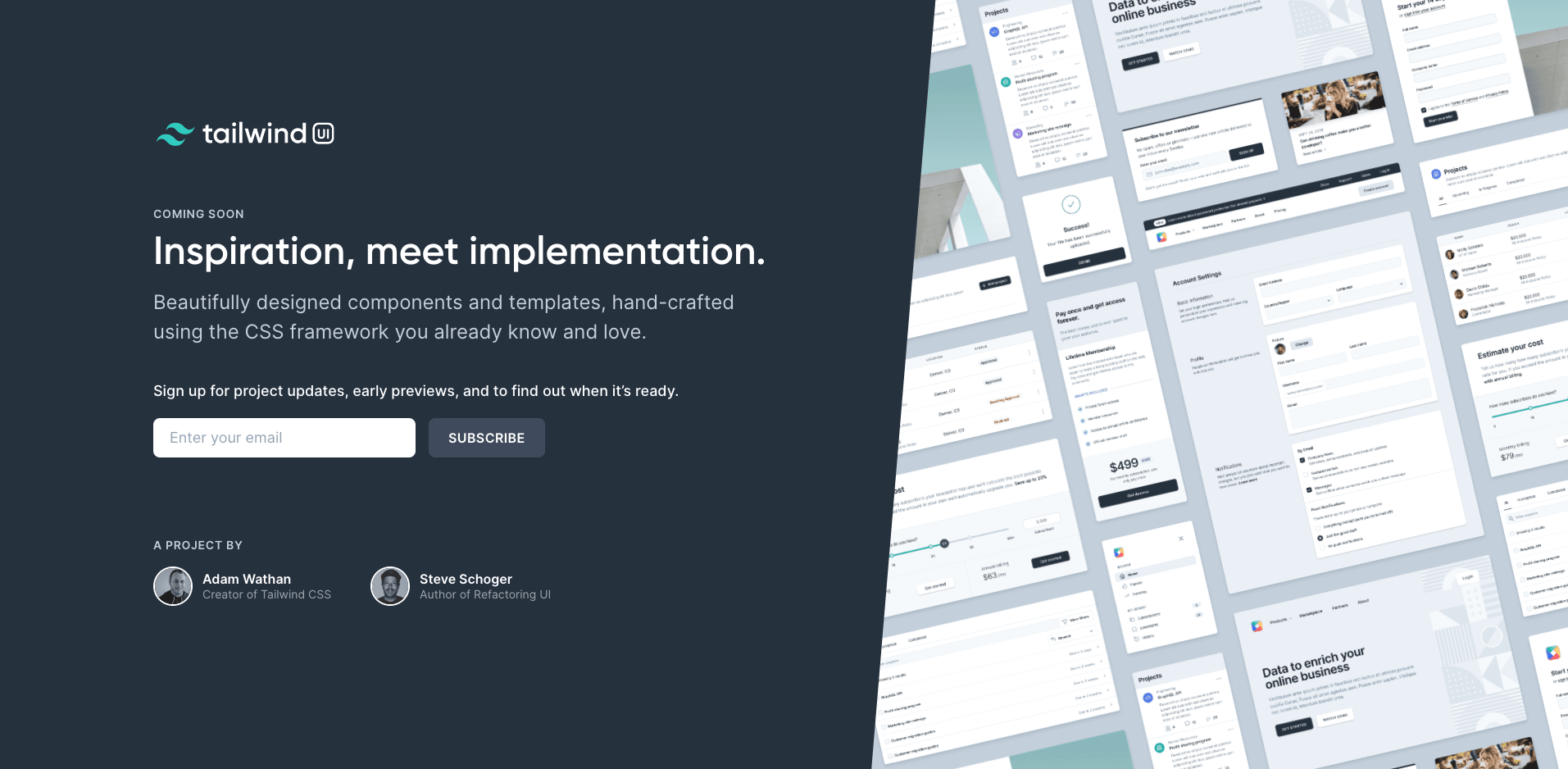
UPDATE: Tailwind UI + Tailwind Figma Kit
Wednesday 17/02/2020
Since originally publishing this article the Tailwind ecosystem has evolved. Tailwind Labs developed https://tailwindui.com, a stunning collection of Fully Responsive UI HTML components that are ready to go out of the box.
And today the team have stepped it up another notch by releasing a Figma Kit that aims to help bridge the gap between web designers and web developers. The speed and agility that these tools are providing to those in the industry is remarkable.
Checkout the intro course to get started.


